In year 13 I have been creating a music video and ancillary texts to go with it. It’s been
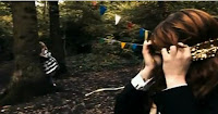
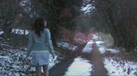
challenging, exciting, hard work but overall rewarding. I have been analysing existing texts and getting ideas and seeing what existing artists have used in order to identify the conventions of their genre. Our music video is of an acoustic/ pop/ folk style. Our music video is very much like Florence and the Machines ‘Dog Days are Over’ video. It has a very outside colourful surreal theme to it, which I think we caught in our production also; with our
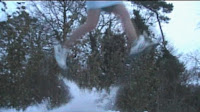
artist singing in the snow in a skirt and jumping around on a snowy trampoline. In Florence’s video it is mostly outside in the woods amongst nature. I think our artist is fairly similar to Florence and the Machine as her music is of a similar genre and also has a similar target audience. So we know that our music video is within the same bracket. In our music video there is a part where our artist is performing, which is a conventional element of music video - as our song has been voted to be acoustic – folk, so therefore watching our artist singing with enthusiasm whilst playing an acoustic guitar helps to enhance and conform to the genre. The main feature in our music video is our stop motion animation it is simple but looks brilliant and effective with this song. The genre of this music and the song feels very creative and Florence and the machines music videos help this image by using creative images within her
music videos, with brigh
t colours and bunting. These concepts of creativity I think appeal to the target audience and follow the genre of the music, as it is a very personal and intimate style of music, with the artist showing who they are and what they are feeling through imagery and their creative ideas. My album cover shows its genre also through the creativity of the images. The front cover for example has an image of the artist on it that looks as if it is a cardboard cut out. This immediately shows the audience that she is an acoustic folk artist or something similar because of the creative way that she is represented with the arts and crafts used within the music video and the digipak production this flows well with the folk - acoustic genre because of the upbeat naturistic and personal feel you get from listening and watching this percific genre. A similar
artist that uses this concept is Lenka as you can see from her album it is very creative and also continues the theme from our music video with the nature and the wild creatures. This is a very admirable album cover as a collage surrounds her. A collage is almost the definition of creativity as it is just a jumble of colours and images that you represent yourself put in to an image that makes some degree of sense. The album sleeve that Lenka has created represents her just as much as my album cover represents my artist’s song and personality. Lenka’s album is very similar to my artist‘s as it has a creative feel and to add to that creativity it opens out to reveal a bigger image. This shows that she has big ideas and a very large creative mind. Very like my artist. These two artists sing similar genres of music also; enhancing the imagery is good for our genre of music. ‘Lenka is a BIG inspiration.’ Continuing from Lenka’s brilliant design I created my creative magazine adve
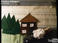
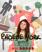
rt with her creative mind album pull out with the artist being surrounded by her creative thoughts. This in itself goes very well with my music video as my artist is sunk in to her animation (creative thoughts). Basically as you can see the advert that I have created shows my artist being surrounded by her thoughts that appear in the music video such as the cotton wool sheep and the felt tree. My artist’s image is also made too look as if she is thinking and enhancing that the imagery surrounding her are her thoughts. My animation was created over a few months with lots of organising, storyboarding, creating and filming! The long process was challanging and to
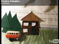
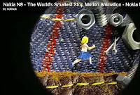
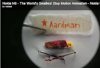
ok many attempts to get it right, we even had a practice shoot to see if we could learn anything from it, we learnt that the smaller the movements the better the effect and the faster you would be able to play it and still look brilliant! we also got ideas from 'the kings of animation' Aardman with their amazing animation called dot, which features a similar design to our music video with a character running from left to right running past interesting scenery and avoiding obsticles. I believe our animation was very well created and has an oustandingly good feel to it, considering it was our first real test of creating a full length animation with a storyline to it. The deadline short coming we finished our animation and started to put it with the music. Shortly afterwards we realised that the animation would not stretch effectivly enough to kee
p the audience interested in the production. We resorted on drawing up storyboards and mood boards of ideas and came up with the idea of the same story just in real life also, with some performance with hopefully the magic of edditing to make it look as if our real life character was part of the animation. This was a challenging ordeal, but i believe that it was certainly worth it in the end, as we now have an incredible first music video and animation combination. Andrew Goodwin speaks about how a narrative and lyrics of a song link to a music video through imagery and the narrative. This relates to my music video as it has a story to the music video that
is easy to follow and the story relates to the lyrics. For example the lyrics ‘I don’t know which way to go, I don’t know which way is home’ combined by a panning of the camera as if the character is lost. Another example of this narrative structure with the lyrics is when the animation is walking through the autumn scene with the leaves being thrown around by the wind, this combined with the lyrics ‘I’m so lost in the wind’ we decided to make the music video relate to the lyrics because it makes it easier for the target audience to follow the narrative during the music video. Goodwin says that, the music video using lyrics may tell a story but will regularly remain unresolved. My music video Challanges this statement as our music video starts with the main character being depressed and s
o therefore singing and the animation is a metaphor of her trying to get over the fact that she needs ‘you’ but by the end of the music video they appear to be back together. Overall I have strengthened the audience appeal by using similar ages characters, themes that teenagers will have started to experience and finally using the animation they can relate to the creativity as they are at the point in life where they need to sculpt their life.

 challenging, exciting, hard work but overall rewarding. I have been analysing existing texts and getting ideas and seeing what existing artists have used in order to identify the conventions of their genre. Our music video is of an acoustic/ pop/ folk style. Our music video is very much like Florence and the Machines ‘Dog Days are Over’ video. It has a very outside colourful surreal theme to it, which I think we caught in our production also; with our
  artist singing in the snow in a skirt and jumping around on a snowy trampoline. In Florence’s video it is mostly outside in the woods amongst nature. I think our artist is fairly similar to Florence and the Machine as her music is of a similar genre and also has a similar target audience. So we know that our music video is within the same bracket. In our music video there is a part where our artist is performing, which is a conventional element of music video - as our song has been voted to be acoustic – folk, so therefore watching our artist singing with enthusiasm whilst playing an acoustic guitar helps to enhance and conform to the genre. The main feature in our music video is our stop motion animation it is simple but looks brilliant and effective with this song. The genre of this music and the song feels very creative and Florence and the machines music videos help this image by using creative images within her music videos, with brigh
 t colours and bunting. These concepts of creativity I think appeal to the target audience and follow the genre of the music, as it is a very personal and intimate style of music, with the artist showing who they are and what they are feeling through imagery and their creative ideas. My album cover shows its genre also through the creativity of the images. The front cover for example has an image of the artist on it that looks as if it is a cardboard cut out. This immediately shows the audience that she is an acoustic folk artist or something similar because of the creative way that she is represented with the arts and crafts used within the music video and the digipak production this flows well with the folk - acoustic genre because of the upbeat naturistic and personal feel you get from listening and watching this percific genre. A similar
  artist that uses this concept is Lenka as you can see from her album it is very creative and also continues the theme from our music video with the nature and the wild creatures. This is a very admirable album cover as a collage surrounds her. A collage is almost the definition of creativity as it is just a jumble of colours and images that you represent yourself put in to an image that makes some degree of sense. The album sleeve that Lenka has created represents her just as much as my album cover represents my artist’s song and personality. Lenka’s album is very similar to my artist‘s as it has a creative feel and to add to that creativity it opens out to reveal a bigger image. This shows that she has big ideas and a very large creative mind. Very like my artist. These two artists sing similar genres of music also; enhancing the imagery is good for our genre of music. ‘Lenka is a BIG inspiration.’ Continuing from Lenka’s brilliant design I created my creative magazine adve
 rt with her creative mind album pull out with the artist being surrounded by her creative thoughts. This in itself goes very well with my music video as my artist is sunk in to her animation (creative thoughts). Basically as you can see the advert that I have created shows my artist being surrounded by her thoughts that appear in the music video such as the cotton wool sheep and the felt tree. My artist’s image is also made too look as if she is thinking and enhancing that the imagery surrounding her are her thoughts. My animation was created over a few months with lots of organising, storyboarding, creating and filming! The long process was challanging and to
 ok many attempts to get it right, we even had a practice shoot to see if we could learn anything from it, we learnt that the smaller the movements the better the effect and the faster you would be able to play it and still look brilliant! we also got ideas from 'the kings of animation' Aardman with their amazing animation called dot, which features a similar design to our music video with a character running from left to right running past interesting scenery and avoiding obsticles. I believe our animation was very well created and has an oustandingly good feel to it, considering it was our first real test of creating a full length animation with a storyline to it. The deadline short coming we finished our animation and started to put it with the music. Shortly afterwards we realised that the animation would not stretch effectivly enough to kee
.JPG) p the audience interested in the production. We resorted on drawing up storyboards and mood boards of ideas and came up with the idea of the same story just in real life also, with some performance with hopefully the magic of edditing to make it look as if our real life character was part of the animation. This was a challenging ordeal, but i believe that it was certainly worth it in the end, as we now have an incredible first music video and animation combination. Andrew Goodwin speaks about how a narrative and lyrics of a song link to a music video through imagery and the narrative. This relates to my music video as it has a story to the music video that
p the audience interested in the production. We resorted on drawing up storyboards and mood boards of ideas and came up with the idea of the same story just in real life also, with some performance with hopefully the magic of edditing to make it look as if our real life character was part of the animation. This was a challenging ordeal, but i believe that it was certainly worth it in the end, as we now have an incredible first music video and animation combination. Andrew Goodwin speaks about how a narrative and lyrics of a song link to a music video through imagery and the narrative. This relates to my music video as it has a story to the music video that  is easy to follow and the story relates to the lyrics. For example the lyrics ‘I don’t know which way to go, I don’t know which way is home’ combined by a panning of the camera as if the character is lost. Another example of this narrative structure with the lyrics is when the animation is walking through the autumn scene with the leaves being thrown around by the wind, this combined with the lyrics ‘I’m so lost in the wind’ we decided to make the music video relate to the lyrics because it makes it easier for the target audience to follow the narrative during the music video. Goodwin says that, the music video using lyrics may tell a story but will regularly remain unresolved. My music video Challanges this statement as our music video starts with the main character being depressed and s
 o therefore singing and the animation is a metaphor of her trying to get over the fact that she needs ‘you’ but by the end of the music video they appear to be back together. Overall I have strengthened the audience appeal by using similar ages characters, themes that teenagers will have started to experience and finally using the animation they can relate to the creativity as they are at the point in life where they need to sculpt their life.


